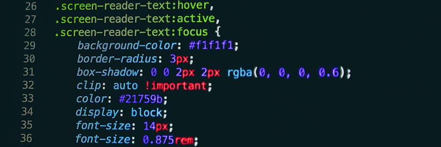
Focus Indicators
Every browser has default focus styles, and unfortunately, out of the box, they aren't very accessible.
The goal of :focus is to give the user guidance on where exactly they are in the document and help them navigate through it. When you tab through a website, you need to be able to follow where the focus has shifted to. Avoid a focus that's too subtle or just not visible at all. The focus is meant to be obvious - some might say the more obvious, the better.
In recent years, browsers have made improvements to their :focus styles, but they're still not perfect and can still be unnoticeable depending on what your design is. So, let's go through what some browsers currently offer.
- Firefox: a simple 1px dotted outline.
- Safari: a blue ring.
- Chrome & Edge: a combination of a solid dark colour and a solid white ring with some offset adjustment.
All very different to each other. Firefox's is barely noticeable. Safari's is better, but problematic if you have a background colour that is similar. Chrome & Edge with recent updates is better but still suffers from problems - if you have a black button on a white background, the button would just show as a bit wider which unless you're looking at it already, won't be that noticeable.
As you can see, it's not completely bad, but it leaves a lot of room for improvement depending on what your site looks like. But how a browser defaults to with focus is not something to concern yourself with as if you take ownership of it and set :focus options as part of your designing process, then what a browser does poorly isn't a concern. It's a simple design choice to add in, and one that doesn't require a lot of CSS to achieve better results. With the four main browsers showing a variety of defaults, it's surely easier to have your own style in place than potentially alienating some users just because they use a certain browser.
An example of where to start is a simple line of CSS to apply a default focus setting to everything. From there, you can amend any sections as you want.
*:focus { border: 2px dotted #000; }
You can then change the focus depending on what it's for. Buttons, for example, would be good to use an offset to give the border some space, making it more visible. Text can highlight or have a solid border.
There could be arguments that you shouldn't change the browser's default behaviour, but when you consider how poorly browsers like Firefox act with focusing, I don't think it can be ignored.
