Stagg Support
Stagg Support - offering support services in Plymouth and the surrounding areas.
Read more about Stagg Support
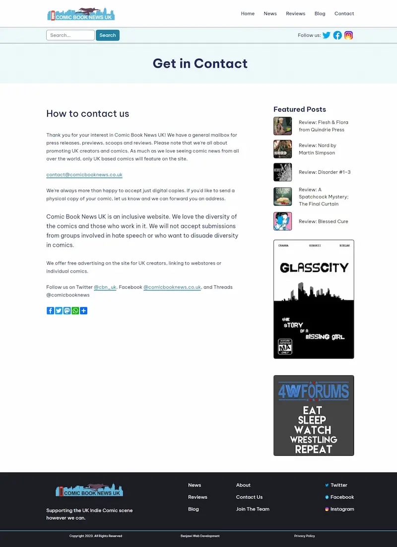
Comic Book News UK is a site that is dedicated to offering exciting comic book news from the UK, and occasionally worldwide since we get a lot of the lovely comic goodness that goes on everywhere, and UK creators don't just live in the UK.
The site looks to focus on offering content by comic fans, FOR comic fans. The UK's indie comics scene is constantly growing, so Comic Book News UK is used as a platform to share news and review recent releases to help spread the word.

Comic Book News UK is a passion project of mine that's been going on for a while. It's had a lot of iterations as I try out new things, but that has also led to some challenges as time goes on.
As I progress with developing, I update aspects of the website, with the aim of making a website that's not in the same mould as others in this particular field.
The article pages themselves were the easiest to design - it's all about the content, as an article page should be. It was fun making some sidebar components, but they aren't the main focus. Keeping it simple and clean on the actual article page was a must, which is why I took a favoured approach of using a white background all over. Others in this field tend to go with a background colour on the sides of the articles, and I didn't feel like this suited the aesthetic I was going for. I didn't want the articles to look boxed in.
Creating a site that's easy to use and showcasing a passion of mine and many other peoples.
The home page went through a few design options. I've generally always had five featured articles, which are to be shown first on the home page. After scribbling down some thumbnails of how the top half should look, I set about creating the three I came up with.
I ended up building all three, which allowed me to settle on option three. The slider was tempting, but it looked a bit thin up top without adding a lot of unnecessary padding. Option two, with the two main featured articles on one row, didn't look great with the three underneath. Having one main featured article (the size of what the slider option would have been), with others underneath worked - all featured are visible and fills up a decent amount of screen, really highlighting that these are our focus articles.

The biggest challenge has been dealing with historical changes. There are years of old articles, which include things like an image gallery at the end of some posts - something I stopped a long time ago, but the old articles are still there.
Historically, I've always ended up building in additional code to account for old posts, but for this build I wanted simplicity. I figured that I can't keep having to think about years old posts - and it's not always big things either. One was some old posts still had HTTP links to images instead of HTTPS from back in the days before SSL certificates were standard and cost a lot. So one of my many string changes to the articles was replacing those. This time around, I updated the database, updating the article and replacing what was needed without having to actually edit each article one by one.
Another challenge has been simplifying what there is. A few pages were unnecessary, and others got merged, so I had to do a few 301 rewrites with the last update.
It's at the point where I'm fairly happy with the design. Anything else I do will likely be behind-the-scenes changes. One I will be working on is the comic adverts in the article sidebar - a free comic book advertisement that is offered on the site. At the moment, it rotates every few days


Stagg Support - offering support services in Plymouth and the surrounding areas.
Read more about Stagg SupportThis website uses cookies to analyse our website traffic and performance; we never collect any personal data. Before continuing to use our website, you agree & accept our Cookie Policy & Privacy.